Author name: Ruby Midwest

How Many Logo Concepts Should a Designer Provide? Industry Standards Explained

How Many Logo Concepts Should a Designer Provide? When you hire a designer to build your brand identity, one of the first questions you’ll ask is simple: how many logo concepts should a designer provide? The answer isn’t as straightforward as a single number. It depends on who you hire, how much you pay, and what kind of strategic thinking goes into the work. At Ruby Midwest, we’ve seen clients confused by wildly different offers. Some freelancers promise ten concepts for a few hundred dollars. Some agencies deliver just one polished direction for several thousand. Both approaches can be valid, and both can also be red flags. Here’s how to make sense of it. Much the same conclusion turns up on carrylovedesigns.com. The Industry Standard: What to Expect in 2026 Across the design industry, the most common range is 2 to 5 initial logo concepts. This range gives clients enough variety to see different creative directions without overwhelming them or diluting the designer’s strategic focus. Here’s a quick breakdown of what’s typical based on the type of provider: Provider Type Concepts Provided Typical Price Range Marketplace / Contest Site 10 to 50+ $50 to $500 Entry-Level Freelancer 3 to 5 $300 to $1,500 Experienced Freelancer 2 to 3 $1,500 to $5,000 Boutique Agency 1 to 3 $5,000 to $25,000 Full-Service Branding Agency 1 to 2 $25,000+ Notice the pattern: as budget and expertise go up, the number of concepts tends to go down. That isn’t laziness. It’s strategy. Why Fewer Concepts Often Means Higher Quality A logo isn’t decoration. It’s a strategic decision that has to work across print, digital, small favicons, huge signage, embroidery, and animation. Senior designers and agencies spend more time on research, positioning, and refinement than on producing options. There’s a solid take on this from a studio that gets this right. When an agency presents a single concept, it’s usually because they’ve done the following: Conducted market and competitor research Interviewed stakeholders and defined brand positioning Explored dozens of internal sketches before narrowing down Built a strong rationale for why one direction is right In other words, the filtering already happened. You’re not paying for choices, you’re paying for a defensible decision. The subject deserves a deeper dive than we can give it here. Freelancer Approach vs Agency Approach Both approaches have merit, but they serve different needs: Freelancers typically present 2 to 3 concepts so the client feels they have creative input and can compare directions side by side. Agencies often present one refined concept backed by strategy documents, because the client is buying expertise and confidence rather than a menu. Red Flags: Too Few or Too Many Concepts The number of concepts alone tells you a lot about the designer’s process and confidence level. Watch for these warning signs. Red Flags When a Designer Offers Too Many Concepts 10 or more initial concepts for a low price. This usually signals templated work, AI-assisted mass output, or a scattergun approach with no strategic thinking. No discovery phase. If a designer jumps straight to sketching without asking about your audience, values, or competitors, expect generic results. Concepts that look wildly different from each other. This suggests the designer is guessing rather than working from a brief. Contest-style platforms. Dozens of options from anonymous designers rarely translate into a cohesive brand identity. Red Flags When a Designer Offers Too Few Concepts One concept with no strategic rationale. A single option can be powerful, but only if it comes with research, positioning, and a clear explanation of why it works. No revision rounds included. Even the best concept needs refinement. Two to three rounds of revisions should be standard. Rushed timelines. A quality logo project takes 2 to 6 weeks minimum. Anything faster with just one concept is usually a template. No exploration shown behind the scenes. Good designers should be able to walk you through how they arrived at their final direction. What Should Be Included Beyond the Concepts The number of concepts is only part of the value. When evaluating a proposal, make sure it also includes: A discovery and briefing phase Moodboards or strategic direction before design begins At least 2 rounds of revisions on the chosen concept Final files in multiple formats (SVG, PNG, PDF, EPS) Color variations (full color, one color, reversed) A basic brand guidelines document Full ownership and usage rights The Ruby Midwest Approach At Ruby Midwest, we typically present 2 to 3 refined concepts after a thorough discovery phase. We believe this range hits the sweet spot: enough variety to demonstrate different strategic directions, but few enough that every concept is polished, defensible, and worth choosing. We’ve found that clients make better decisions when they have fewer, stronger options rather than a buffet of half-baked ideas. Quality over quantity isn’t just a slogan. It’s how great brands are built. Frequently Asked Questions How many logo concepts is standard? Most professional designers and agencies present between 2 and 5 initial logo concepts. Freelancers tend to offer 3, while agencies often present 1 to 2 highly refined directions. Is one logo concept enough? Yes, if it comes with a strong strategic rationale, moodboards, and revision rounds. Top branding agencies frequently present a single direction because they’ve already done the filtering internally. Why do some designers offer 10 or more concepts? Usually because they’re working at a low price point, using templates, or lack a strategic process. High concept counts often signal quantity over quality. How many revision rounds should be included? Two to three revision rounds on the selected concept is standard. Unlimited revisions can sometimes be a red flag, since it may indicate the designer expects the client to art-direct the work. For the wider picture, see How Many Concepts / Ideas. What is the golden rule of logo design? Simplicity. A great logo should be recognizable at any size, work in one color, and communicate the brand’s essence without unnecessary detail. Should I choose a freelancer or an

How Many Logo Concepts Should a Designer Provide? Industry Standards Explained Read More »
7 Signs Your Business Logo Needs a Redesign in 2026

Your logo is the visual handshake between your business and the world. It appears on your website, invoices, social media, packaging, storefront, and every ad you run. When it starts working against you rather than for you, the damage is quiet but real: lost trust, weaker recall, and fewer conversions. At Ruby Midwest, we work with business owners across industries who often ask the same question: how do I know when it’s time to redesign my logo? This guide walks you through 7 clear signs your logo needs a redesign, with real-world examples and a self-assessment checklist you can run in under 15 minutes. Why Logo Redesigns Matter More in 2026 The way people encounter logos has shifted dramatically. In 2026, most brand impressions happen on small mobile screens, inside app icons, on video thumbnails, and increasingly through AI-generated search results and voice-first interfaces. A logo built for a printed business card in 2012 is not built for that environment. Refreshing your logo is not vanity. It is a business decision that affects recognition, trust, and conversion. Let’s look at the signs. 7 Signs Your Logo Needs a Redesign 1. It Doesn’t Scale Cleanly Across Devices and Formats The single most common issue we see: a logo that looks fine on a desktop website but turns into mush on a mobile app icon, a social profile picture, or a browser favicon. Quick test: Shrink your logo to 32 x 32 pixels. Can you still identify it? If details disappear, lines merge, or text becomes unreadable, you have a scalability problem. Thin strokes vanish at small sizes Text-heavy logos become illegible Complex illustrations turn into a blur Gradients pixelate on print materials 2. It Looks Dated Next to Your Competitors Design trends evolve, and your audience notices, even subconsciously. If your logo still uses heavy drop shadows, chrome effects, swooshes, or overly literal illustrations from a decade ago, customers may perceive your business as behind the times. Line up your logo next to your top 5 competitors. If yours looks like it belongs in a different era, that’s a warning sign. Outdated does not always mean bad, but it should be a deliberate choice, not an accident. 3. Your Business Has Evolved, But Your Logo Hasn’t Companies grow. You might have started as a local bakery and now ship nationwide. Maybe you launched as a single-service consultancy and now offer a full suite. If your logo still tells the story of who you were 5 or 10 years ago, it’s creating a mismatch. Ask yourself: Does the logo reflect our current products or services? Does it match the audience we serve today, not the one we served at launch? Does the tone (playful, corporate, luxury, etc.) still fit our positioning? 4. It Lacks a Clean Digital Version (SVG, Transparent, Responsive) If your only logo file is a low-resolution JPG someone emailed you years ago, that’s a redesign trigger on its own. Modern brands need a full toolkit: Asset Why It Matters SVG vector file Sharp at any size, essential for web Transparent PNG Overlay on photos, videos, dark backgrounds Monochrome version Print, embroidery, single-color contexts Favicon / app icon Recognition in browser tabs and mobile screens Horizontal & stacked layouts Flexibility across placements 5. Nobody Remembers It A good logo is memorable. If you have shown your logo to friends or new customers and nobody can describe it 10 minutes later, it’s failing at its most basic job. The napkin test: Ask 5 people who have seen your brand to sketch your logo from memory. If the results look nothing alike (or are simply blank), your logo lacks the distinct visual anchor it needs. 6. It No Longer Reflects Your Values or Audience Brands are built on values, and values change. A company that has repositioned toward sustainability, premium service, or a younger demographic often finds its old logo sending the wrong signals. Examples we see often: A tech company using a hand-drawn mascot that now feels unprofessional to enterprise buyers A wellness brand with harsh geometric shapes that contradict its calm, natural positioning A family business using overly corporate typography that hides its personality 7. You’re Embarrassed to Share It This one is subjective but revealing. If you hesitate before handing out a business card, avoid putting your logo on merchandise, or crop it out of photos, your gut is telling you something. Business owners who love their brand promote it everywhere. Hesitation is a signal. Quick Self-Assessment: Do You Need a Redesign? Answer yes or no to each: Does your logo look pixelated or unclear at small sizes? Would your logo feel out of place launched today? Has your business changed direction, audience, or offerings? Are you missing modern file formats (SVG, transparent PNG)? Can customers describe your logo without looking at it? Does it visually match your current values and tone? Are you proud to put it everywhere? Scoring: If you answered “yes” to 3 or more red-flag questions (1, 2, 3, 4) or “no” to questions 5, 6, or 7, it’s time to seriously consider a redesign. Redesign vs. Refresh: Which One Do You Need? Situation Recommended Approach Logo is recognized but looks slightly dated Refresh (evolve typography, refine shapes, modernize color) Business has fundamentally changed Full redesign Logo has scalability or technical problems Rebuild in vector, possibly simplify No brand recognition equity to protect Full redesign, bold direction Common Mistakes to Avoid When Redesigning Chasing trends: A logo should last 7 to 10 years, not follow this season’s aesthetic Designing by committee: Too many opinions dilute clarity Throwing away all recognition: If people know your mark, evolve it rather than erase it Skipping strategy: A logo is a business asset, not decoration. Start with positioning, audience, and values Forgetting the system: A logo lives inside a full brand identity. Plan colors, typography, and usage rules together Final Thoughts A logo redesign is not about following trends or reinventing your brand for no reason. It’s about

7 Signs Your Business Logo Needs a Redesign in 2026 Read More »

Wordmark vs Lettermark Logo: Key Differences and When to Use Each

Choosing between a wordmark vs lettermark logo is one of the first real branding decisions a business owner faces. Both are text-based, both look clean and professional, but they serve very different purposes depending on your company name, your industry, and how recognizable your brand already is. At Ruby Midwest, we help businesses build identities that actually work in the real world, not just on a mood board. So let’s break down these two logo styles clearly, with examples, and help you figure out which one belongs on your storefront, website, and business card. What Is a Wordmark Logo? A wordmark (sometimes called a logotype) is a logo made entirely from the full name of your brand, styled with custom or carefully selected typography. There’s no icon, no symbol, just the name itself rendered in a distinctive way. The font choice, spacing, color, and any subtle modifications carry the entire personality of the brand. That’s why wordmarks feel deceptively simple but are actually difficult to design well. Famous Wordmark Examples Google – playful, colorful, friendly sans-serif Coca-Cola – flowing script, instantly recognizable for over a century FedEx – clever hidden arrow tucked between the E and x Visa – bold, confident, trustworthy Disney – signature-style script tied to nostalgia What Is a Lettermark Logo? A lettermark (also called a monogram logo) is built from initials, usually two to four letters that represent a longer company name. Instead of writing out the entire name, you compress it into something short, punchy, and easy to remember. Lettermarks rely heavily on typography too, but the goal is different: they exist to simplify a name that would otherwise be too long, awkward, or hard to pronounce. Famous Lettermark Examples IBM – International Business Machines becomes three iconic letters HBO – Home Box Office, instantly digestible CNN – Cable News Network, perfect for a news ticker HP – Hewlett-Packard, modernized into two letters NASA – National Aeronautics and Space Administration, the ultimate example Wordmark vs Lettermark Logo: Side-by-Side Comparison Feature Wordmark Lettermark Content Full brand name Initials only Best for name length Short, memorable names Long or complex names Readability at small sizes Can struggle if name is long Excellent Brand recognition required Low to medium High (people need to know what the letters mean) Versatility Great for signage and headers Perfect for app icons, favicons, merch Design difficulty High (typography must do all the work) Medium to high When to Use a Wordmark Logo A wordmark is your best friend when your business name is the strongest asset you have. If your name is unique, memorable, or carries meaning that you want customers to absorb every time they see it, you should put that name front and center. Choose a wordmark when: Your brand name is short (1 to 3 words) Your name is distinctive or invented (think Spotify, Hulu, Kodak) You’re a new brand trying to build name recognition You operate in industries where trust comes from clarity: legal, finance, consulting, hospitality You want flexibility to drop the name into headers, packaging, and signage without confusion When to Use a Lettermark Logo A lettermark works best when your full name is a mouthful or when you’ve already earned enough recognition that initials alone do the job. Choose a lettermark when: Your business name has 4 or more words (especially common for agencies, law firms, and institutions) Your name is hard to pronounce or spell internationally You need a logo that works at tiny sizes, like app icons or social media profile pictures You’re in an industry with a tradition of monograms: fashion, luxury, professional services You plan to grow into a brand where customers naturally abbreviate your name anyway Industry Fit: Which Style Wins Where? Industry Recommended Style Tech startups Wordmark Law firms Lettermark Fashion & luxury Both, often lettermark for monograms Restaurants & cafes Wordmark Media & broadcasting Lettermark Consumer goods Wordmark B2B services Lettermark (if name is long) Common Mistakes to Avoid Choosing a wordmark with a generic font. A wordmark lives or dies by its typography. Default fonts make your brand forgettable. Picking a lettermark before you have recognition. If nobody knows what your initials stand for, you’re invisible. Ignoring scalability. Test your logo at favicon size. If you can’t read it, rethink it. Copying competitors. If every law firm in your city uses a lettermark, a clean wordmark might actually stand out more. Skipping the trademark check. Both styles can run into legal issues if similar marks already exist. How to Decide: A Quick Self-Assessment Ask yourself these five questions: Is my business name shorter than 12 characters? Is my name easy to pronounce in my main markets? Will customers see my logo mostly at full size, or in small digital spaces? Do I have brand recognition already, or am I starting fresh? Does my industry favor a traditional or modern look? If you answered yes to questions 1 and 2, lean wordmark. If your answers point to long names, small digital placements, or established recognition, lean lettermark. Frequently Asked Questions What is the difference between a lettermark and a wordmark? A wordmark uses your full company name styled in distinctive typography, while a lettermark uses only the initials of your company name. Wordmarks build name awareness, lettermarks simplify long or complex names. What is the difference between a logomark and a wordmark? A logomark (also called a brandmark or symbol) is an icon or image with no text, like the Apple apple or the Nike swoosh. A wordmark is text-only. Many big brands use both together in what’s called a combination mark. What are the main types of logos? The seven commonly recognized types are wordmarks, lettermarks, brandmarks (symbols), combination marks, emblems, abstract marks, and mascots. Wordmarks and lettermarks are the two text-based categories. Can a brand switch from a wordmark to a lettermark later? Yes, and many do. Companies like Federal Express became FedEx, and Kentucky Fried Chicken became KFC. Once your full name earns recognition,

Wordmark vs Lettermark Logo: Key Differences and When to Use Each Read More »

How Much Does a Custom Logo Design Cost in 2026? A Complete Pricing Breakdown

If you’ve ever asked three different designers for a logo quote, you’ve probably received three wildly different numbers. One says $150, another says $1,800, and a branding studio quotes you $12,000 for what looks like the same deliverable. So what gives? At Ruby Midwest, we’ve worked with hundreds of small business owners trying to make sense of branding budgets. This guide breaks down exactly what a custom logo design cost looks like in 2026, what you actually get at each price point, and how to choose the right tier for your business stage. The Short Answer: Custom Logo Design Cost in 2026 In 2026, a custom logo design typically costs anywhere from $50 to $50,000+. That’s a huge range, so here’s a more useful breakdown: Budget freelancers / marketplaces: $50 to $500 Mid-level freelancers: $500 to $3,500 Boutique design studios: $3,500 to $15,000 Branding agencies: $15,000 to $50,000+ Top-tier global agencies: $75,000 to $500,000+ Most small businesses in the United States in 2026 spend between $800 and $4,500 on a custom logo, which lands them in the upper-freelancer to entry-studio range. Logo Pricing Tiers Compared at a Glance Tier Price Range Turnaround Best For Marketplace / AI-assisted $50 to $500 1 to 5 days Side hustles, MVPs, very early startups Freelancer (mid-level) $500 to $3,500 1 to 3 weeks Small businesses, local brands Boutique studio $3,500 to $15,000 3 to 8 weeks Funded startups, growing SMBs Branding agency $15,000 to $50,000+ 2 to 4 months Established companies, rebrands Top-tier agency $75,000+ 3 to 9 months National / global brands What You Actually Get at Each Price Point 1. The $50 to $500 Tier This is the world of Fiverr, 99designs, AI logo generators, and beginner freelancers. You’re paying for a deliverable, not a process. What you usually get: 1 to 3 logo concepts 2 or 3 revision rounds PNG and JPG files (sometimes a vector) Little to no brand strategy The honest tradeoff: Quality is unpredictable. You might get lucky, or you might receive a logo built from a stock template that 200 other businesses are also using. 2. The $500 to $3,500 Tier This is the sweet spot for most small businesses in 2026. Mid-level freelancers in this range have real portfolios, references, and a structured process. What you usually get: Discovery call and brand questionnaire Light competitor research 2 to 4 unique concepts 3 to 5 revision rounds Full vector files (AI, SVG, EPS, PDF) Color and black-and-white variations A simple mini brand sheet (fonts and colors) 3. The $3,500 to $15,000 Tier You’re now hiring a small design studio or a senior independent designer. Logo design is part of a broader visual identity package. What you usually get: Strategic brand discovery workshops Market and competitor analysis Mood boards and visual direction Primary logo, secondary logo, monogram, and icon Color palette, typography system, and usage rules A real brand guidelines PDF (15 to 40 pages) Stationery or social media starter assets 4. The $15,000 to $50,000+ Tier This is full-service branding agency territory. The logo itself is almost the smallest part of the engagement. What you usually get: Brand positioning and messaging strategy Customer research and stakeholder interviews Naming services (if needed) Comprehensive identity system Brand voice guidelines Launch assets (web, packaging, social, print) Trademark search support What Actually Influences Custom Logo Design Cost? Designer experience. A designer with 12 years of experience and recognizable clients will charge 5 to 10 times more than a beginner, and rightly so. Scope of deliverables. One logo file is cheap. A full identity system with brand guidelines is not. Strategy depth. Research, positioning, and discovery workshops add real cost because they take real hours. Number of revisions. Unlimited revisions almost always mean a higher upfront price (or scope creep later). Usage rights. A logo for a local bakery and a logo for a national franchise carry different licensing implications. Turnaround time. Rush jobs typically add 25 to 50 percent to the price. Geography. US and Western European designers generally cost more than designers in other regions, though 2026 rates have leveled out somewhat thanks to remote work. Hidden Costs Most Small Business Owners Forget Trademark search and registration: $250 to $2,000 depending on jurisdiction File conversions for print and embroidery: $50 to $300 Brand guidelines document: $500 to $3,000 if not included Updates and refreshes: Plan for a refresh every 5 to 7 years Stock font licensing: $20 to $500 per font family How to Choose the Right Tier for Your Business Here’s the framework we use at Ruby Midwest with our clients: Pre-revenue or testing an idea? Stay under $500. Don’t over-invest before you know your business will exist in 12 months. Generating revenue but under $250K per year? The $1,000 to $4,000 range is your sweet spot. Established business doing $500K to $5M per year? Invest $5,000 to $15,000 for a complete identity. Your brand is now an asset. Larger company or planning national expansion? $25,000+ with a real branding agency. The ROI on positioning alone justifies it. Why Cheap Logos Often Cost More in the Long Run We see this constantly: a business pays $99 for a logo, uses it for 18 months, then realizes it’s: Not actually unique (template-based) Not legally protectable Not scalable across platforms Not aligned with their actual positioning Then they pay $5,000 to redo it properly, plus the cost of replacing every piece of marketing material. The cheap logo ended up being the most expensive option. FAQ: Custom Logo Design Cost How much should I charge for a custom logo design as a freelancer? If you’re a beginner, $300 to $800 per project is reasonable. Mid-level freelancers in 2026 charge $1,500 to $3,500. Senior freelancers with strong portfolios regularly charge $5,000 and up. Is it worth paying more than $1,000 for a logo? Yes, if your business is past the validation stage. Above $1,000 you typically get strategy, originality, full file packages, and a designer who actually answers your emails. Below $1,000

How Much Does a Custom Logo Design Cost in 2026? A Complete Pricing Breakdown Read More »

Vector vs Raster Logo Files Explained: What Every Business Owner Needs to Know

Vector vs Raster Logo Files: Why It Matters for Your Business You just invested in a brand-new logo. Your designer sends over a folder full of files with extensions like .AI, .EPS, .SVG, .PNG, and .JPG. You have no idea which one to use, or why there are so many versions in the first place. Sound familiar? You are not alone. One of the most common points of confusion for business owners is the difference between vector and raster logo files. Understanding these two formats can save you time, money, and a whole lot of frustration when it comes to printing business cards, updating your website, or ordering signage. In this guide, we break down vector vs raster in simple, non-designer language so you know exactly what you have, what you need, and what to ask for. What Is a Raster Image? A raster image is made up of pixels. Think of it like a mosaic: thousands (or millions) of tiny colored squares come together to form the image you see. When you zoom in far enough, you start to see those individual squares, and the image looks blurry or “pixelated.” Common raster file types include: JPG (JPEG) – The most widely used image format on the web and in photography. PNG – Supports transparent backgrounds, commonly used for logos on websites. GIF – Mostly used for simple animations and low-color graphics. TIFF – A high-quality raster format often used in professional printing. Key characteristic: Raster images have a fixed resolution. A 500 x 500 pixel logo will look fine as a small icon on your website, but if you try to blow it up to fit a banner or a billboard, it will look blurry and unprofessional. What Is a Vector Image? A vector image is built using mathematical paths rather than pixels. Instead of storing color information for each tiny dot, a vector file stores instructions like “draw a curve from point A to point B with this color fill.” This means a vector file can be scaled to any size, from a favicon on a browser tab to a wrap on a building, without losing a single bit of quality. Common vector file types include: AI (Adobe Illustrator) – The native format of Adobe Illustrator, the industry-standard tool for logo design. EPS (Encapsulated PostScript) – A versatile vector format that can be opened by many design applications. SVG (Scalable Vector Graphics) – An open-standard vector format ideal for websites and digital applications. PDF – Can contain vector data and is widely accessible for viewing and printing. Vector vs Raster: Side-by-Side Comparison Feature Vector Raster Made of Mathematical paths and shapes Pixels (tiny colored dots) Scalability Infinitely scalable without quality loss Loses quality when enlarged File size Generally smaller for logos Can be very large at high resolutions Best for Logos, icons, illustrations, print Photographs, detailed digital images Editing Easily editable (colors, shapes, sizing) Harder to edit without quality loss Common formats AI, EPS, SVG, PDF JPG, PNG, GIF, TIFF Transparency support Yes PNG and GIF yes; JPG no Why Vector Files Are Essential for Your Logo Your logo is the visual foundation of your brand. It appears on everything: your website, social media profiles, business cards, packaging, merchandise, vehicle wraps, trade show banners, and more. Each of these applications requires a different size, and sometimes a different background. Here is why vector files are non-negotiable for a professional logo: 1. Infinite Scalability A vector logo can be scaled from the size of a postage stamp to the side of a skyscraper without any loss in quality. Raster logos start to fall apart the moment you stretch them beyond their original resolution. 2. Print Quality Professional printers almost always require vector files. Whether you are printing business cards, brochures, or large-format signage, vector ensures your logo comes out crisp and clean every time. Submitting a low-resolution JPG to a printer is one of the most common (and costly) mistakes business owners make. 3. Easy Color Adjustments Need a white version of your logo for a dark background? Or a single-color version for embroidery? With a vector file, your designer can make these changes in seconds. With a raster file, it is a much more difficult and time-consuming process. 4. Smaller File Sizes Because vector files store mathematical data instead of pixel-by-pixel color information, they tend to be significantly smaller than high-resolution raster files. This is especially useful for web performance. 5. Future-Proofing Your Brand Design trends change. Your business evolves. Having your logo as an editable vector file means you (or any designer you hire in the future) can easily update, modify, or adapt your logo without starting from scratch. Common Logo File Types Explained Let us go through each file type you are likely to receive from a designer and explain when to use it. AI (Adobe Illustrator) Type: Vector Best for: Master editable file, used by designers for modifications Note: You need Adobe Illustrator to open this file. Think of it as the “source code” of your logo. Always keep this file safe. EPS (Encapsulated PostScript) Type: Vector Best for: Sending to printers, sharing with other designers who may not use Illustrator Note: A universal vector format that most professional design and print software can open. SVG (Scalable Vector Graphics) Type: Vector Best for: Websites and digital applications Note: SVG files are lightweight, scalable, and display perfectly on screens of all sizes. If your web developer asks for an SVG, this is why. PDF (Portable Document Format) Type: Can be vector or raster (depending on how it was created) Best for: Sharing with clients and printers, easy to view on any device Note: A PDF exported from Illustrator or another vector program will retain its vector properties. PNG (Portable Network Graphics) Type: Raster Best for: Website use, social media, presentations, any digital use where you need a transparent background Note: PNG supports transparency, which makes it ideal for placing your logo on colored or photographic

Vector vs Raster Logo Files Explained: What Every Business Owner Needs to Know Read More »

Optical Kerning vs Metric Kerning: When to Use Each in Your Designs

Optical Kerning vs Metric Kerning: A Complete Guide for Designers If you have ever opened InDesign, Illustrator, or Figma and wondered whether to choose optical kerning or metric kerning, you are not alone. This is one of the most common typographic decisions designers face, and the wrong choice can make beautifully crafted layouts look subtly off. In this guide, we break down exactly how optical kerning and metric kerning work, when each option produces better results, and how to decide which one to use for headlines, body text, and logo projects. What Is Kerning, and Why Does It Matter? Kerning is the adjustment of space between individual letter pairs. Unlike tracking, which adjusts spacing uniformly across a range of characters, kerning targets specific pairs like AV, To, or WA where the default spacing can look uneven to the human eye. Good kerning makes text feel balanced and readable. Poor kerning creates awkward gaps or collisions that distract readers, even if they cannot consciously identify the problem. Most professional design applications give you two automatic kerning methods to choose from: metric and optical. Understanding the difference between them is essential for any serious design work. What Is Metric Kerning? Metric kerning (sometimes called “metrics” in software menus) uses the kerning tables built into the font file by the typeface designer. When a font is created, the designer carefully defines spacing values for hundreds or even thousands of specific letter pairs. These values are stored inside the font as metadata. When you select metric kerning in your design software, the application reads those built-in pair values and applies them automatically. Strengths of Metric Kerning Reflects the original intent of the type designer, who spent considerable time fine-tuning letter pair relationships. Produces highly consistent results across long blocks of text. Works exceptionally well with professional, well-crafted fonts that include extensive kerning tables. Generally the default setting in most design applications for good reason. Weaknesses of Metric Kerning Only as good as the kerning data in the font. Budget or free fonts often have incomplete or missing kerning tables. Cannot adapt when you mix different typefaces in the same line of text. May produce looser spacing than desired at large display sizes. What Is Optical Kerning? Optical kerning ignores the font’s built-in kerning tables entirely. Instead, the design software analyzes the actual shapes of adjacent characters and calculates spacing on the fly based on their outlines. The algorithm tries to create visually even spacing by looking at the geometry of each letter pair. Strengths of Optical Kerning Works well with fonts that have poor or missing kerning tables. Produces good results when mixing two or more different typefaces on the same line. Can deliver tighter, more visually balanced spacing at large display sizes. Useful as a starting point before manual kerning adjustments. Weaknesses of Optical Kerning Ignores the carefully crafted decisions of the original type designer. May produce inconsistent results in long passages of body text. The algorithm is not perfect and can sometimes over-correct or under-correct specific pairs. Can slow down performance in very long documents because spacing is calculated in real time. Optical Kerning vs Metric Kerning: Side-by-Side Comparison Feature Metric Kerning Optical Kerning Data source Built-in font kerning tables Algorithm analyzes character shapes Best for body text Yes (with quality fonts) Only if font has poor kerning data Best for headlines Sometimes too loose Often tighter and more balanced Mixed typefaces Poor (tables don’t cover cross-font pairs) Good (shape-based calculation adapts) Logo and display work Starting point, then manual adjustments Better starting point for manual refinement Free/budget fonts Often produces poor results Usually better than metrics in this case Performance Fast (reads stored values) Slightly slower (real-time calculation) When to Use Metric Kerning Metric kerning should be your default choice for body text when you are working with professional, well-made typefaces. Foundries like Adobe, Monotype, and independent type designers invest significant effort into their kerning tables, and using metrics honors that work. Ideal scenarios for metric kerning: Long-form body text in books, magazines, reports, and websites where consistency across thousands of words is critical. Professional fonts from reputable foundries that you know include thorough kerning data. Tabular data and numbers where consistent spacing ensures columns align properly. Templates and brand guidelines where reproducibility matters across different team members and machines. When to Use Optical Kerning Optical kerning shines in situations where the built-in font data either does not exist, is incomplete, or simply does not apply. Ideal scenarios for optical kerning: Headlines and display text set at large sizes where even minor spacing inconsistencies become very visible. Free or budget fonts that lack comprehensive kerning tables. Mixing typefaces on the same line, such as pairing a serif with a sans-serif in a headline. Decorative or script fonts where the built-in metrics may not account for all stylistic variations. Logo design as a starting point before you apply manual kerning adjustments. Practical Workflow: Headlines, Body Text, and Logos Body Text For paragraphs and running text, start with metric kerning. If you notice uneven spacing (which can happen with lower-quality fonts), switch to optical and compare. In most cases with a professional typeface, metrics will look better because the type designer optimized pair values for reading sizes. Headlines and Titles Large text magnifies every spacing flaw. Try optical kerning first for headlines, then compare with metrics. Optical kerning tends to produce tighter, more visually appealing spacing at display sizes. After selecting your preferred automatic method, manually adjust any pairs that still look off. Common trouble pairs include AV, To, LT, Yo, and WA. Logo and Wordmark Design Neither automatic method is sufficient on its own for logo work. Use optical kerning as your starting point because it adapts to the specific letterforms, then manually kern every single pair. Logo typography demands pixel-perfect spacing, and no algorithm can replace a trained eye at this level of detail. Mixed Typeface Settings Whenever you combine two different fonts on the same line, metric kerning cannot

Optical Kerning vs Metric Kerning: When to Use Each in Your Designs Read More »

graphic design

Top 5 Tips for Creating a Cohesive Brand Identity Through Logo and Web Design

A cohesive brand identity is essential for any business looking to stand out in a crowded marketplace. Your logo and web design play a crucial role in shaping this identity, helping to convey your brand’s values and personality to your audience. In this article, we’ll explore five tips for creating a cohesive brand identity through logo and web design integration. 1. Understand Your Brand Before you start designing your logo or website, take the time to understand your brand. Define your brand’s values, mission, and target audience. This will help guide your design decisions and ensure that your logo and website reflect your brand identity. 2. Consistent Branding Elements Consistency is key to creating a cohesive brand identity. Use consistent branding elements such as colors, fonts, and imagery across your logo and website. This will help create a unified look and feel that resonates with your audience. 3. Design a Memorable Logo Your logo is the visual representation of your brand, so it’s important to design a logo that is memorable and reflects your brand’s personality. Keep your logo simple and versatile so that it can be easily adapted for use across different platforms and media. 4. Seamless Website Integration Integrate your logo seamlessly into your website design to create a cohesive brand experience. Place your logo in a prominent position on your website, such as the top left corner, and use consistent colors and fonts to tie your logo and website together. 5. Use Imagery to Tell Your Story Incorporate imagery into your logo and website design to help tell your brand’s story. Use images that reflect your brand’s values and personality, and use them consistently across your branding materials. By following these five tips, you can create a cohesive brand identity that resonates with your audience and helps you stand out in a crowded marketplace. Remember to keep your brand’s values and personality in mind throughout the design process, and you’ll be well on your way to creating a strong and memorable brand identity.

Top 5 Tips for Creating a Cohesive Brand Identity Through Logo and Web Design Read More »

Wordpress

10 Essential Tips for Maximizing Your Divi Theme Experience

Divi theme offers a fast, easy, and fun way to build websites for everyone even for those who are novices in website-building. If it’s your first time building a website, then the Divi theme is an excellent option for you. To make the best out of your Divi theme website, you have to ensure that it is as effective and as functional as possible. In this light, let’s take a look at the 10 essential tips that will help maximize your Divi theme experience. 1. Choose an Optimized Hosting Provider To ensure that you maximize your Divi theme experience, avoid using the traditional shared hosting as this will not allow your website to function as fast as possible. Dedicated hosting, VPS hosting, and cloud hosting are your better options because, with these providers, you will not be sharing resources with a bunch of other websites on just one server. 2. Declutter Your Website’s Database Just like a home, a website database can be cluttered over time as you continue to add new items or data that will eventually become obsolete. Keep your website optimized by installing the WP-Optimize, a plugin that can thoroughly clean your website’s database. 3. Optimize Your Domain Name System or DNS When it comes to optimizing your DNS, consider using reliable platforms such as Cloudflare, Google Public DNS, or Quad9. The Domain Name System is key to your website’s fast response time which can lag due to the multiple domains that have to be accessed to pull up the page. 4. Use a Content Delivery Network or CDN Using a CDN will allow your website to deliver content from multiple servers around the globe. It is one of the best ways to maximize your Divi theme experience as it can dramatically enhance the speed of content delivery to anyone who visits your website no matter their location. 5. Add Website Caching A cache is a copy of your website page that is stored once a user visits your site. Website caching can make all the difference in enhancing the user’s experience because it dramatically lessens the load time every time the user returns to your website. 6. Optimize by Adding Minification and Aggregation Plugins While minification refers to the shrinking of your files, aggregation is all about combining the files together and both methods are highly important in reducing your website’s load time. Adding minification and aggregation plugins can definitely bring your Divi theme experience to a whole new level. 7. Enable Divi Visual Builder for Mobile Devices According to Statista, over 50% percent of global website traffic in the first quarter of 2023 was generated from mobile devices. In this light, enabling Divi Visual Builder is an important step to expanding your audience and enhancing their user experience on their respective mobile devices. 8. Optimize Images Although large images can entice people who are visiting your website, you’re still at risk of losing your audience because large image files can increase the load time of your page. To resolve this, you can bring down the size of your image or compress it at tinypng.com. 9. Optimize Videos Unlike image optimization, optimizing a video is not as easy but there is a trick that is now widely used by website builders. Instead of going through the tedious process of reducing the size of your video, you can upload the video to YouTube and then use that link on your website. 10. Test Your Website Loading Speed The last tip for maximizing your Divi theme experience is to test your website’s loading speed. Having this data will allow you to identify if there are certain areas that you need to improve on in order to maximize the user experience on your website. for a more detailed info about the Divi theme.

10 Essential Tips for Maximizing Your Divi Theme Experience Read More »

Wordpress

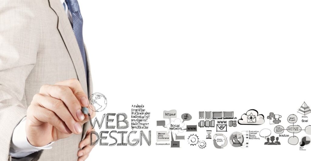
How to Design a Website Using WordPress

Designing a website is no easy feat if you were to create it from scratch. Fortunately, investing too much time and effort in designing your website is no longer necessary since you can now use an open-source content management system (CMS) that will allow you to create your website in no time. There are a few options for you when it comes to using such a system but WordPress is by far your best option as it is simple, fast, and free. 1. Plan Your Website Layout Planning is a vital part of your website design process because it will help you organize your content and visualize the overall layout that you want to appear on your website. When it comes to planning your website layout, create a site map diagram that will allow you to carefully plan the contents of your website. From there, you can then decide the number of pages that you want to have and the layout as well as the contents of each page. 2. Subscribe to a Website Hosting Plan Website hosting is like renting a space online where you can place your website to make it available on the internet. Fortunately, there is a plethora of website hosting services that offers affordable and reliable domain hosting plans that will fit your every need. Simply choose your website hosting provider then subscribe to your preferred website hosting plan. Once done, you may then pick your domain name which is basically a name that you want to call your website. 3. Install WordPress Whether you’re a new website designer or you just simply want to build your website the easiest way, installing WordPress would be the best way to get you started. WordPress development allows you to manage your content easily and for free. To begin, simply install WordPress then sign up for an account and wait for your website to be created. Once your website is ready, you may now enter the domain name that’s attached to your website hosting plan and proceed with installing a WordPress theme as well as your plugins. 4. Create a Custom Logo Design A website logo is an important feature of your website because it serves as a visual representation of your brand. The logo symbolizes your brand’s core values and it helps identify your products or services to online consumers. One of the best things about creating a website design using WordPress is that it comes with a logo customization option that will allow you to create your unique logo within the platform. Simply go to your WordPress dashboard and create a custom logo design that will carry your brand’s identity. On top of that, the logo also comes with a site navigation function that allows the users to easily return to the home page by simply clicking on the logo. 5. Add Your Contents Before adding your content, you must first enter your site information on WordPress such as your site title and taglines then select your categories. Once done, you may then begin adding content to your WordPress by going to the dashboard and clicking on the “Posts” tab. In adding a new post, simply enter the title of your post and type its content or paste it from a word processor. Add a few tags then publish the post to your website.

How to Design a Website Using WordPress Read More »

logo software

Best Software To Use For Creating Custom Logos

There are a lot of different software programs out there that you can use to create a custom logo. But which one is the best? Well, it really depends on your needs and what you’re looking for in a logo design program. If you need something simple and straightforward, then you might want to check out Adobe Photoshop or Illustrator. These are both great programs for creating basic logos. If you’re looking for something a little more complex, then you might want to consider CorelDRAW or Inkscape. These programs offer a wide range of features and options that will allow you to create a truly unique logo. There are lots of other tools out there. Of course, if you’re not sure what you need or how to use any of these programs, then you can always hire a professional logo designer to create a custom logo for you. If you’re looking for something simple: Logomakr: This online tool is perfect for those who want to create a logo without any fuss. With Logomakr, you can create a logo in minutes, without having to worry about design software or complex processes. Tailor Brands: This online tool is perfect for those who want a bit more control over their logo design. With Tailor Brands, you can tweak your logo until it’s just right, and then download it for use on your website or social media platforms. Logo Garden: This online tool is perfect for those who want to create a professional-looking logo without spending a lot of money. With Logo Garden, you can choose from a variety of templates and designs, and then customize them to perfection. If you’re looking for something more complex: Adobe Photoshop: Photoshop is the industry-leading design software, and it’s perfect for those who want to create a custom logo with complex graphics and effects. It takes a lot of time and practice to master Photoshop. However, that experience can be rewarding as the software isn’t just good for making logos. It’s also good for a lot of other purposes in graphic design. Adobe Illustrator: Illustrator is another industry-leading design software, and it’s perfect for those who want to create vector-based logos. Illustrator rewards those who can work well with a drawing tablet. If you’re an excellent artist with your hands, then Illustrator is easily one of the best tools to use. CorelDRAW: This software is perfect for those who want to create logos with a bit more flair. With CorelDRAW, you can add special effects, textured fills, and even 3D elements to your logo. The good news is that CorelDRAW is a lot easier to use as compared to Adobe’s suite of products. Despite being simple and intuitive, you can create marvelous work with CorelDRAW. These are just a few of the best software programs that you can use to create a custom logo. If you need help deciding which one is right for you, then you can always ask someone who is familiar with logo design or read online reviews. Whichever program you choose, make sure that it has all the features and options that you need to create a professional-looking logo.

Best Software To Use For Creating Custom Logos Read More »

About Us

We are a team of creative designers and website developers working day and night to give our clients best-in-class designs for different industries and niches.
Follow us:

Contact Info

Subscribe

Newsletter

Get the latest create news. Subscribe!

You have been successfully Subscribed! Ops! Something went wrong, please try again.
Copyright © 2022 Ruby Midwest Designs. All Rights Reserved.